5 BEST things about “Apple TV 4’s” !!

Rushikesh Ajmere
By Rushikesh Ajmere
3 Min Read

Apple Tv is more progressing than any other Apple products.As the STEVE JOBS said in an interview about Apple TV

“I finally cracked it, It will have the simplest user interface you could imagine”

But after that time Jobs passed away only some improvements have been done to Apple TV. Words of Jobs “simplest UI” were was of no use.

Siri has been included to iPHONE when Jobs were alive it helped the Apple TV too.. Let’s look about else abou the new Apple TV

1. The Main Menu :

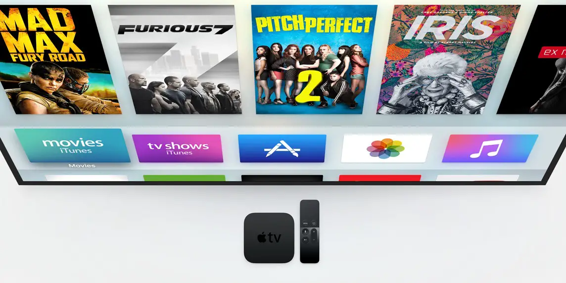
As we know earlier the icons will be the mixtures taken from iOS 7/8/9 and yes it is in so called “tvOS UI”.But the Apple have putted more creativity in it, it is now boxy and clean looking, no text grids at bottom making it more classy. Apple animation to it when you select the icon the icons comes out and the shadow is formed in behind.

2. New Icons:

When you get from one icon to the other the animation takes place (as you can see above). The icons goes slightly from one to the other and the object remains constant and the background moves in circular path and forms a shadow at bottom .. That looks pretty cool right??

3. Apple TV Gets iOS 7/8/9’s added in one :

If you were not a fan of iOS 7  it has improved in the past two iOS’s, and it have a very good change breezel-less   graphics which does not wastes’ the screen portion, allows you to enjoy your TV programs . The new iTUNES in the Apple TV fills every part of the TV with the colors (earlier was a black screen behind) and have a translucent background around it which looks very cool

4. The Pane : 

The side pane is redesigned and looks very neat. It conquers the right amount of space in the screen and has a very pleasing font used, which represents the quality of a multi-dollar company..

5. Siri :

When the SIRI gets called the screen turns translucent black and a classy line at the bottom with attractive colours just above it, it types what we have said to it … As we higher our speaking pitch the colours gets raised up.. The best thing is that the activity continues when siri is opened .. As obvious it is more accurate than the earlier versions. The siri which has been added to the iOS 9 is pretty same as we seen in tvOS.

What do you think about this “AWESOME” changes ? Do let us know in the comment section below … We appreciate your response !!
Share This Article
Follow:
A 13 years boy who loves to play with tech and be in them all the time and reading and writing articles and increasing vocabulary.. You can contact him by sending email at : [email protected]
Leave a Comment

Apple Tv is more progressing than any other Apple products.As the STEVE JOBS said in an interview about Apple TV

“I finally cracked it, It will have the simplest user interface you could imagine”

But after that time Jobs passed away only some improvements have been done to Apple TV. Words of Jobs “simplest UI” were was of no use.

Siri has been included to iPHONE when Jobs were alive it helped the Apple TV too.. Let’s look about else abou the new Apple TV

1. The Main Menu :

As we know earlier the icons will be the mixtures taken from iOS 7/8/9 and yes it is in so called “tvOS UI”.But the Apple have putted more creativity in it, it is now boxy and clean looking, no text grids at bottom making it more classy. Apple animation to it when you select the icon the icons comes out and the shadow is formed in behind.

2. New Icons:

When you get from one icon to the other the animation takes place (as you can see above). The icons goes slightly from one to the other and the object remains constant and the background moves in circular path and forms a shadow at bottom .. That looks pretty cool right??

3. Apple TV Gets iOS 7/8/9’s added in one :

If you were not a fan of iOS 7  it has improved in the past two iOS’s, and it have a very good change breezel-less   graphics which does not wastes’ the screen portion, allows you to enjoy your TV programs . The new iTUNES in the Apple TV fills every part of the TV with the colors (earlier was a black screen behind) and have a translucent background around it which looks very cool

4. The Pane : 

The side pane is redesigned and looks very neat. It conquers the right amount of space in the screen and has a very pleasing font used, which represents the quality of a multi-dollar company..

5. Siri :

When the SIRI gets called the screen turns translucent black and a classy line at the bottom with attractive colours just above it, it types what we have said to it … As we higher our speaking pitch the colours gets raised up.. The best thing is that the activity continues when siri is opened .. As obvious it is more accurate than the earlier versions. The siri which has been added to the iOS 9 is pretty same as we seen in tvOS.

What do you think about this “AWESOME” changes ? Do let us know in the comment section below … We appreciate your response !!
Share This Article
Follow:
A 13 years boy who loves to play with tech and be in them all the time and reading and writing articles and increasing vocabulary.. You can contact him by sending email at : [email protected]
Leave a Comment