The world famous entertainment platform Netflix, is one of the largest digital streaming services online, serving more than 94 million paid-plans subscribers on its network. Today, Netflix redesigns it’s desktop streaming UI and brings a better, sleeker, and more fluid design. It seems Netflix finally moved on to a simpler, more convenient design, with less aggressive contrast and simpler appearance.
The Older Player UI
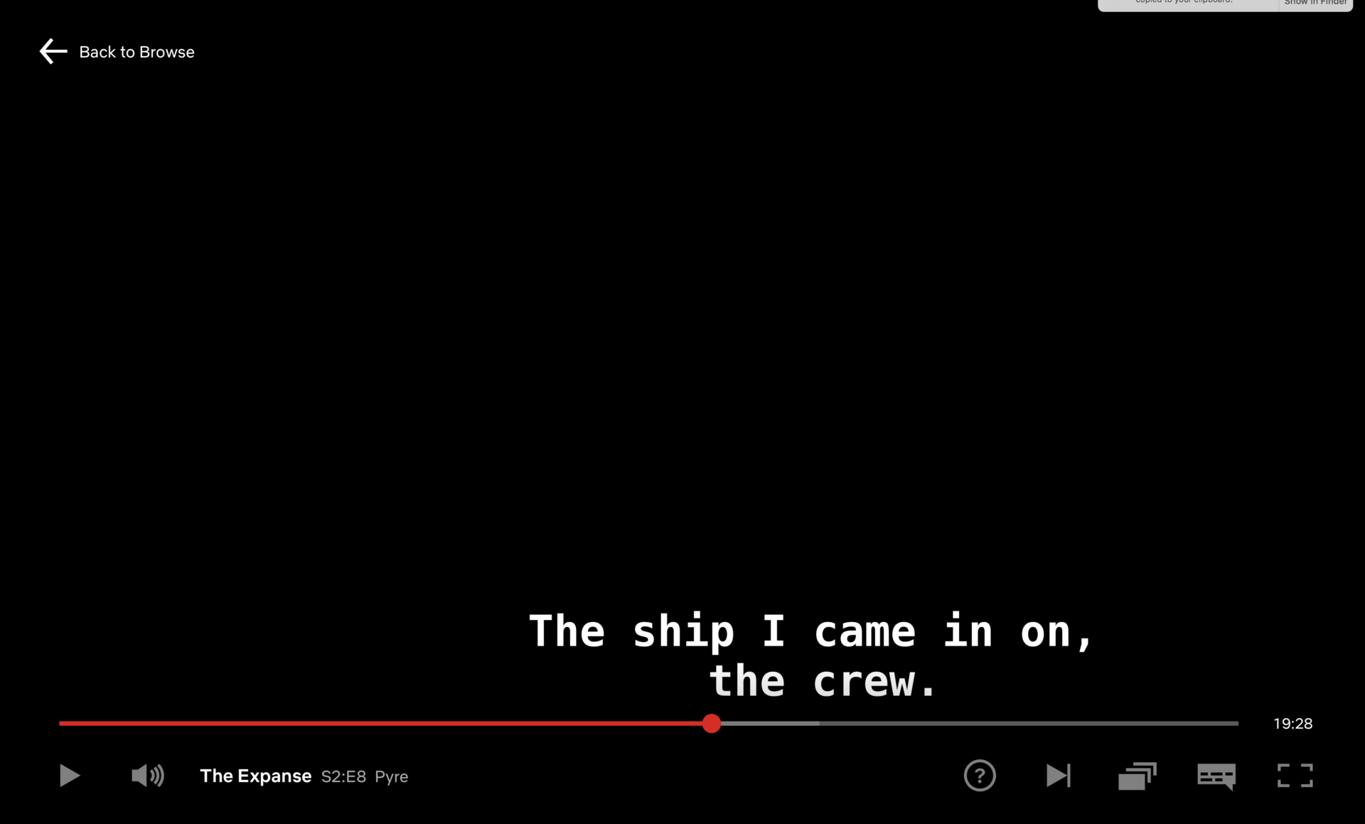
In the last iteration, the Netflix Player UI looked like the image below. Netflix does not allow the media content to be captured in screenshots. Nonetheless, we used to see a major black fade from bottom of the screen, whenever hovered over the media to control the player options. Furthermore, notice the buttons, layouts, fonts and caption style. However, this is the older player.
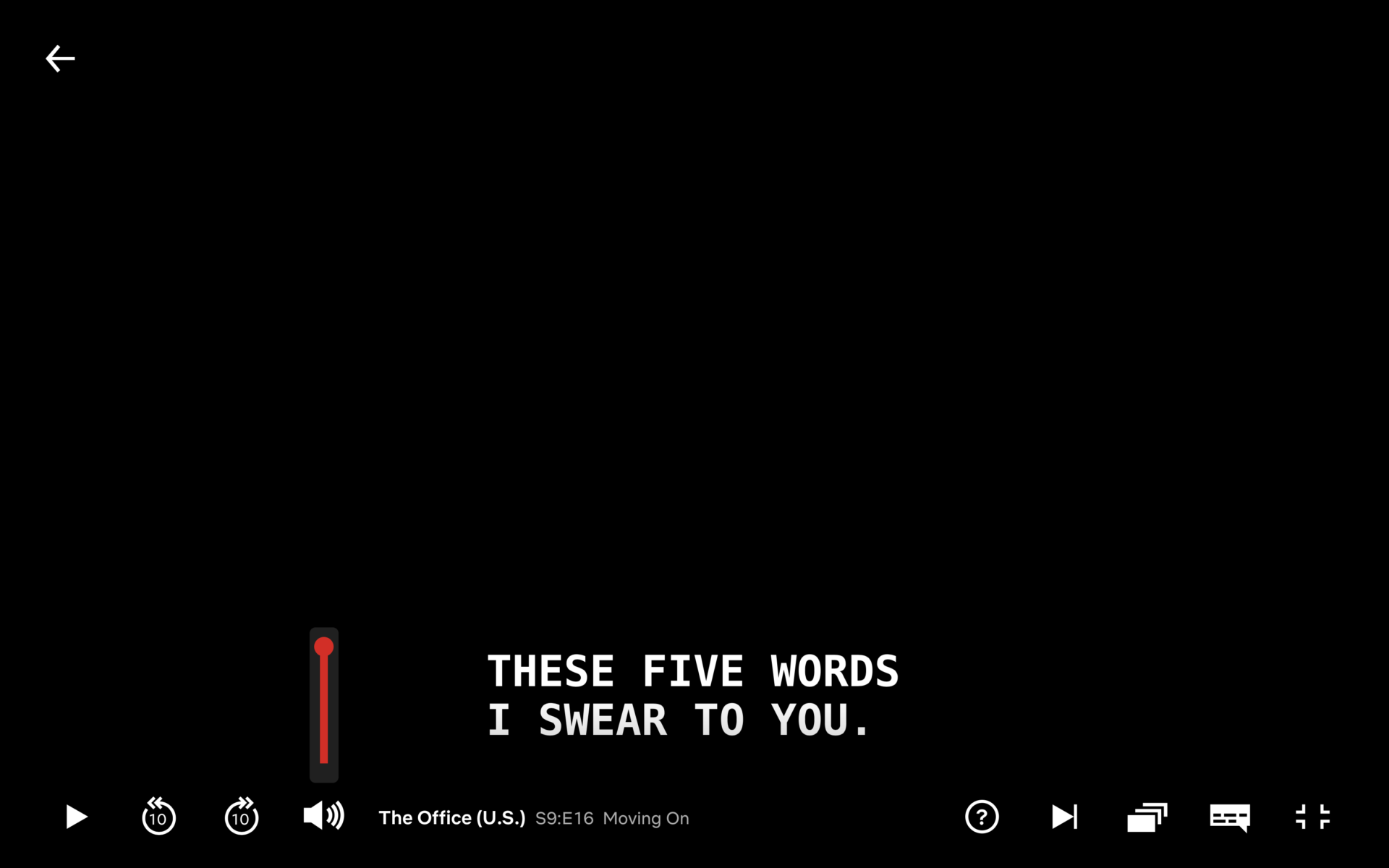
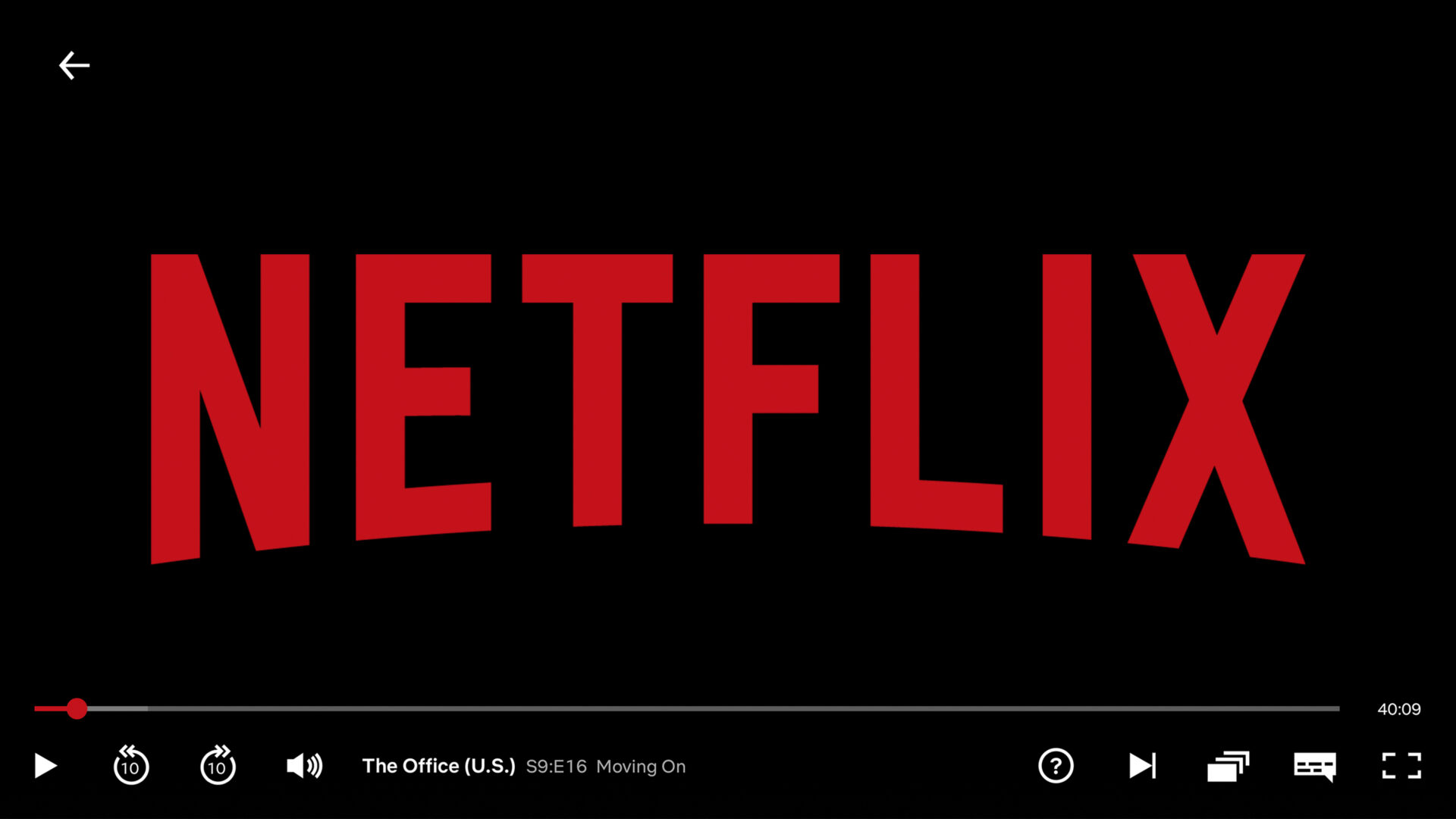
The New Updated Player UI
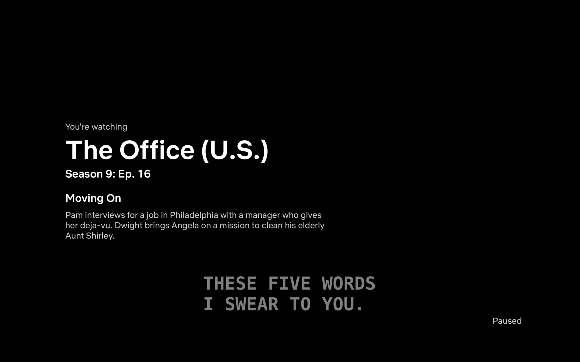
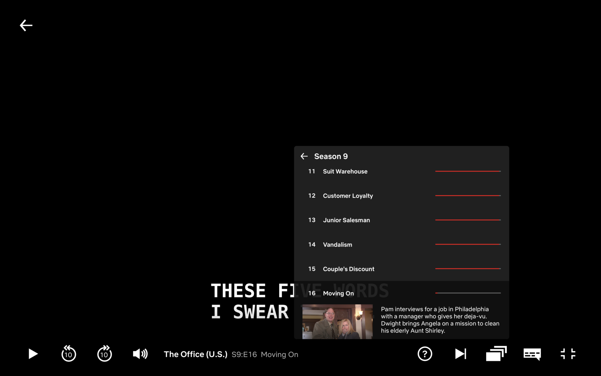
The first thing visible is the title screen, visible when you leave the media paused for a while. There aren’t many changes to it except for the cleaner overall look, everything is more hierarchical and spaced out. Do notice that there is no longer the use of shades of greys to demonstrate content hierarchy, it’s simple and white, with spaces between. The second thing you notice is the player. Again, the greys and the black fade from bottom are completely removed. Everything is simplified in this iteration of the player and buttons are reorganized too. We see 10-seconds skip ahead and backwards buttons added, with simplified and more block-like play/pause, volume, and other control buttons.
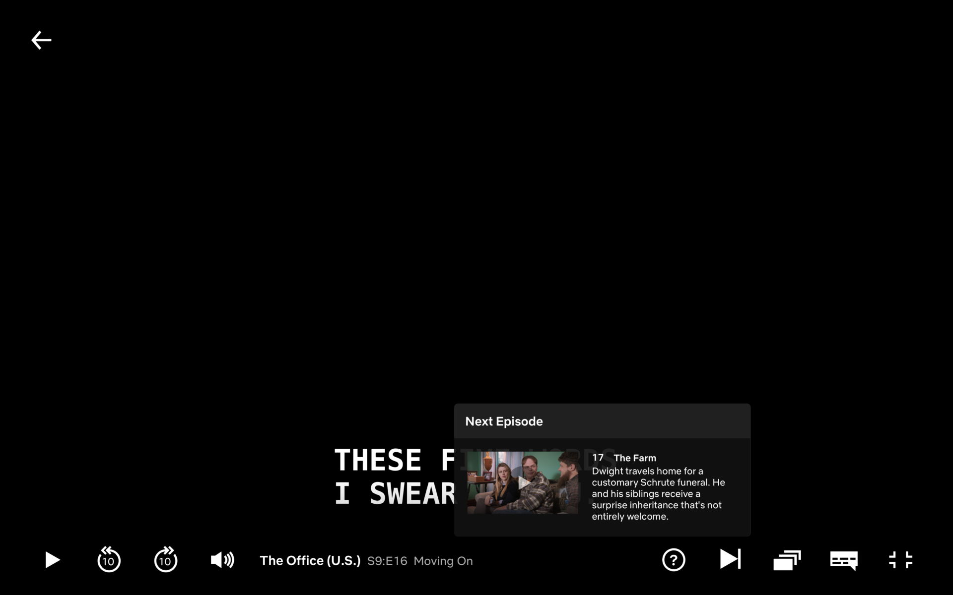
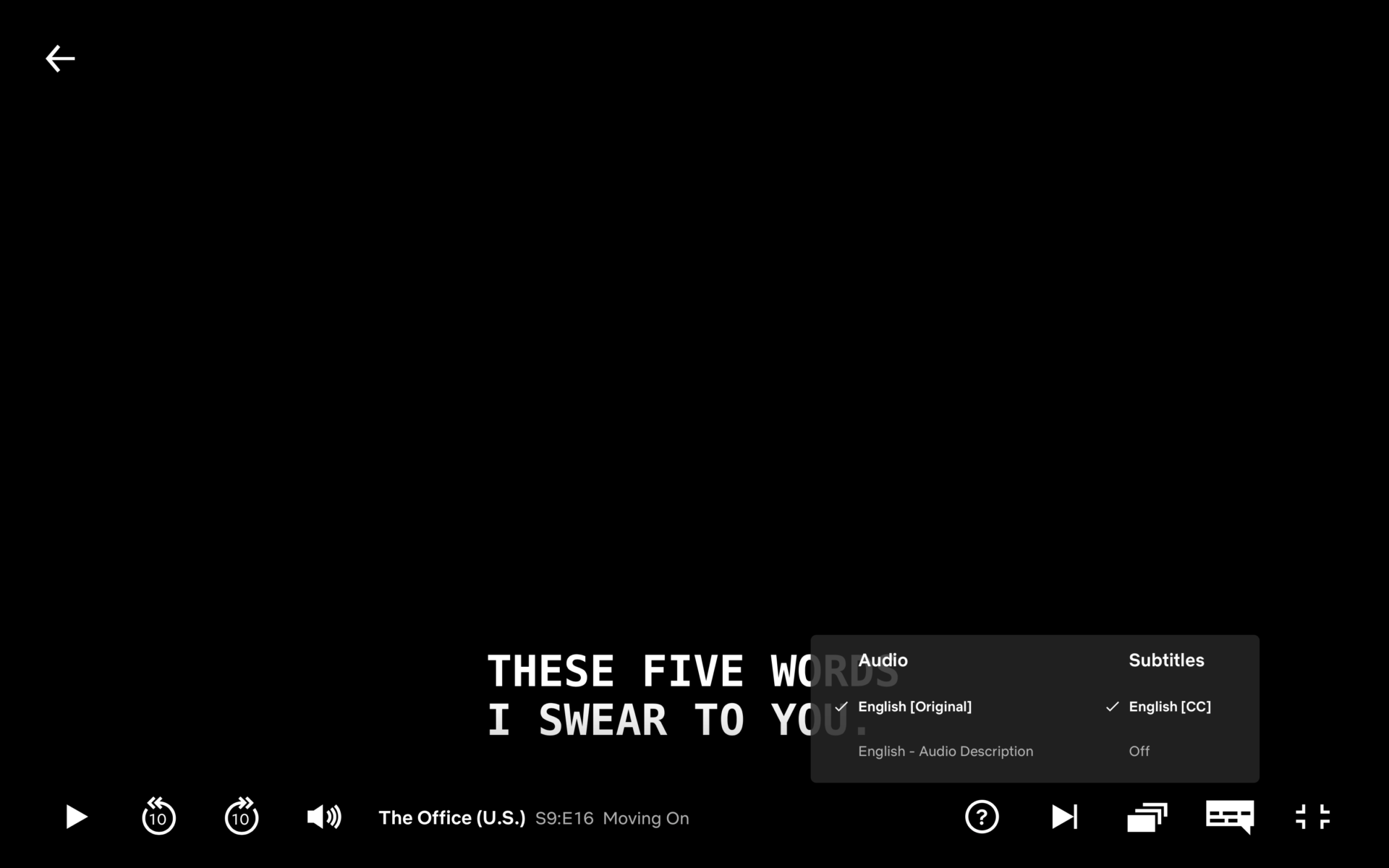
Also notice the larger and white text (which initially used to be grey in the previous version of the player), makes it more convenient to read, as it is easy on eyes. The episode list section is more translucent and streamlined. It shoes progress but in a more sleeker and simplified approach.the same is the case with the “next episode” box. The Caption box and Volume control is also redesigned and allocated in a sleeker fashion. The volume controls, especially, become more 2-dimensional in terms of design, thus play easy on eyes. They are also vertical and streamlined, right next to the 10-seconds forward and backwards buttons (which weren’t present before).