YouTube for Android Gets a Revamped UI with Bottom Navigation Bar

Karandeep Singh
By Karandeep Singh
2 Min Read

YouTube app for Android has sported its current UI for quite a long time and is due for a revamp. Google was testing a redesigned interface for the app since September last year and is now rolling out to all the users. The redesigned layout brings a few major changes to the interface, the most noticeable of them all being the navigation bar.

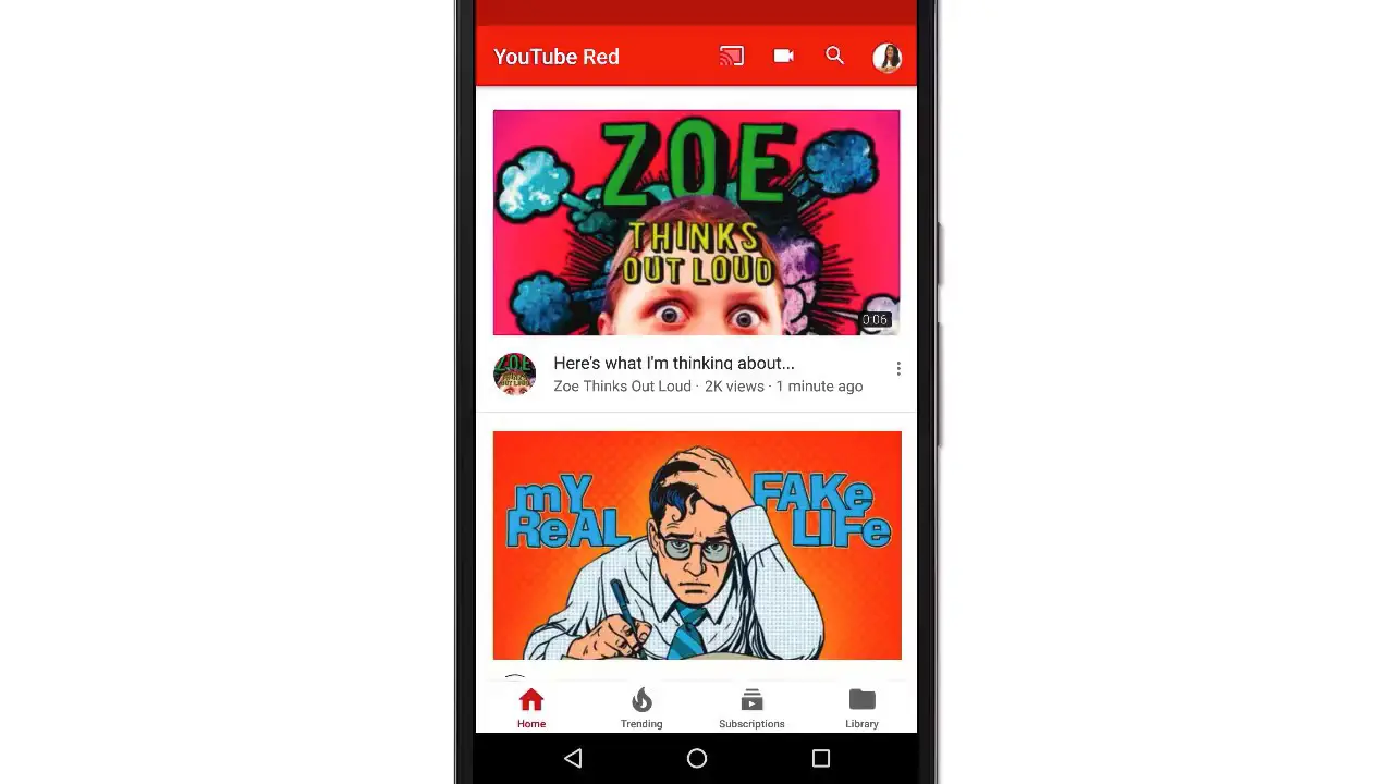
We have been accustomed to a navigation bar positioned on the top, which can be swiped sideways to jump from one section to the other. With the new layout, the navigation bar now sits on the bottom with four sections – Home, Trending, Subscriptions, and Library.

The top bar is now much narrower and includes a few handy tools, including the Account section. The upload button, which used to be a floating one, has also been moved to the top bar, which also includes a button to cast your videos, search button, and your profile picture to access your YouTube account.

Account and Library are two separate sections now with this update. You can access all your likes, favourites, uploads, and playlists in the Library, while the account information and app settings will be there in the Account.

YouTube Help Forum notes:

The app remembers where you left off on each tab. For example, if you scroll down through the Home feed, then go to your Subscriptions tab, and then return to Home, you can easily pick up where you left off.

https://www.youtube.com/watch?v=2aGE-HcjUwU

It also mentions that the new design is already available for the iOS users and is ‘slowly rolling out’ to Android. It seems that the roll out is a bit too slow as we still haven’t received the update on any of our Android devices.
Share This Article
Follow:
When not imparting tech gyaan, Karan can be found engrossed in his favourite TV show with a mug full of coffee on one side and nachos on the other. A good laugh, some striking stories and a lot of catchy music is all he needs to pacify his anxious mind.
Leave a comment

YouTube app for Android has sported its current UI for quite a long time and is due for a revamp. Google was testing a redesigned interface for the app since September last year and is now rolling out to all the users. The redesigned layout brings a few major changes to the interface, the most noticeable of them all being the navigation bar.

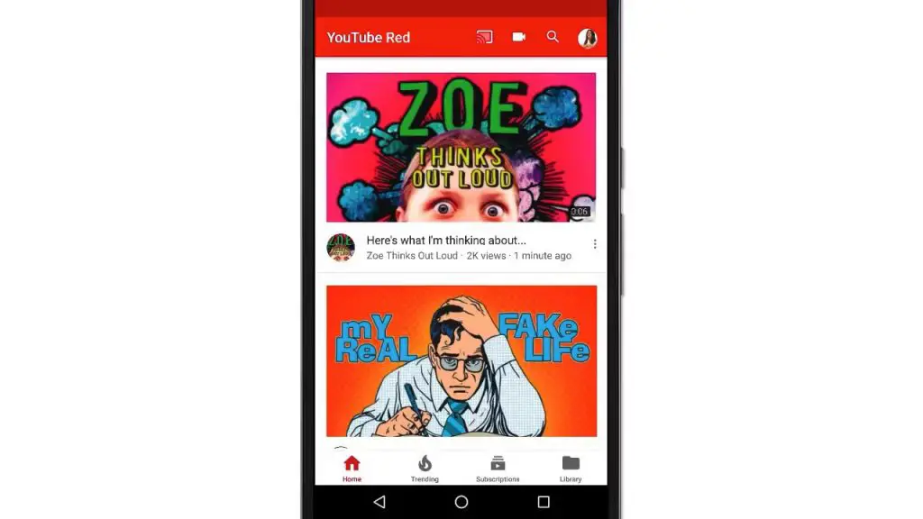
We have been accustomed to a navigation bar positioned on the top, which can be swiped sideways to jump from one section to the other. With the new layout, the navigation bar now sits on the bottom with four sections – Home, Trending, Subscriptions, and Library.

The top bar is now much narrower and includes a few handy tools, including the Account section. The upload button, which used to be a floating one, has also been moved to the top bar, which also includes a button to cast your videos, search button, and your profile picture to access your YouTube account.

Account and Library are two separate sections now with this update. You can access all your likes, favourites, uploads, and playlists in the Library, while the account information and app settings will be there in the Account.

YouTube Help Forum notes:

The app remembers where you left off on each tab. For example, if you scroll down through the Home feed, then go to your Subscriptions tab, and then return to Home, you can easily pick up where you left off.

https://www.youtube.com/watch?v=2aGE-HcjUwU

It also mentions that the new design is already available for the iOS users and is ‘slowly rolling out’ to Android. It seems that the roll out is a bit too slow as we still haven’t received the update on any of our Android devices.
Share This Article
Follow:
When not imparting tech gyaan, Karan can be found engrossed in his favourite TV show with a mug full of coffee on one side and nachos on the other. A good laugh, some striking stories and a lot of catchy music is all he needs to pacify his anxious mind.
Leave a comment