Oxygen OS 11: Not Just A Hands-On!

Tarun Tej
By Tarun Tej
11 Min Read

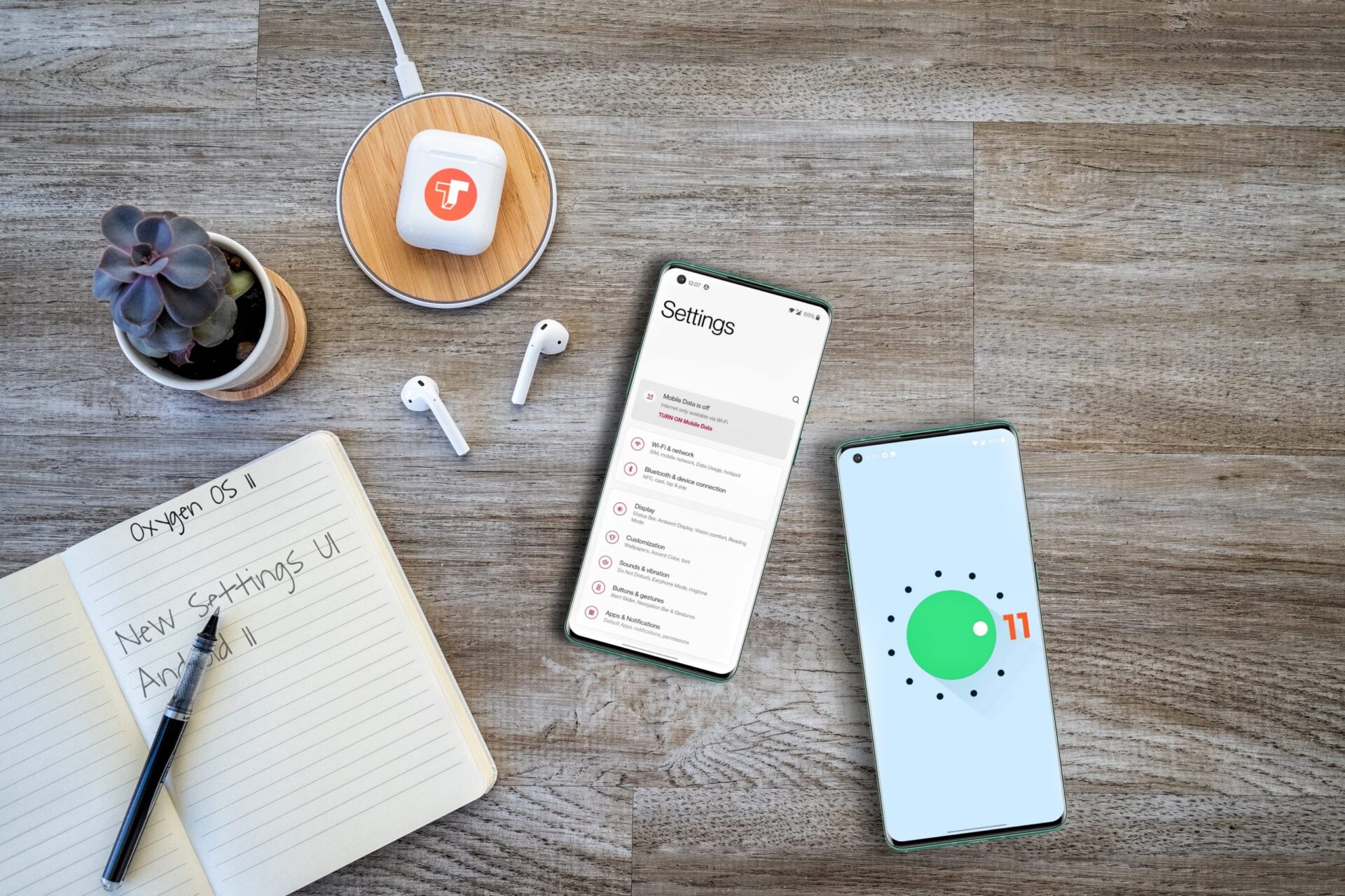
OnePlus’ Oxygen OS is one of the most popular Android UI’s out there. Oxygen OS was first launched in 2015, and it was pronounced as a better version of Stock Android. Recently, OnePlus rolled out the Android 11 Developers Preview which brings the much-awaited Oxygen OS 11 update. We installed this latest Developer Preview on our OnePlus 8 and we can without a doubt say that this is the biggest overhaul any Android-based UI has ever seen!

OnePlus seems like they are done with that near to stock Android experience. This is a very bold step by the company, I mean, let’s face it, Oxygen OS is the USP for the OnePlus devices. The UI takes a lot of best parts from Samsung’s One UI, which is not totally a bad thing, but they made it explicit! Oxygen OS 11 brings a lot of features and changes to the table. For starters, the app menu headers are redesigned, settings menu gets minimalistic icons, and more importantly, Oxygen OS 11 brings the most requested Always-on display feature.

OnePlus has confirmed all its major new changes in a dedicated blog post announcing the rollout of the final Oxygen OS 11 or Android 11 Betas. This is the final build of Android 11 on OnePlus hardware before a series of Open Betas in the coming months. The “Key” changes and the known issues are described by OnePlus as mentioned below:

[su_spacer size=”30″]


[su_spacer size=”30″]

[su_box title=”Key Notes:” box_color=”#ED2024″ title_color=”#ffffff” radius=”0″]

  1. New visual design (including Weather app, Launcher, Gallery, Notes.
  2. New layout for more comfortable and convenient one-handed operation.
  3. Always-on display function, including 11 new clock styles. Live wallpaper that changes according to the time of day.
  4. New OnePlus Sans font that improves readability. Optimized Dark Mode, including the ability to automatically turn on and off and a shortcut in Quick Settings.
  5. 3 new Zen Mode themes, more timing options, and a new Group feature to let you experience Zen Mode with your friends.
  6. New Gallery function that automatically creates a weekly story based on your photos and videos.

[/su_box]

[su_spacer size=”30″]


[su_spacer size=”30″]

Always-on Display

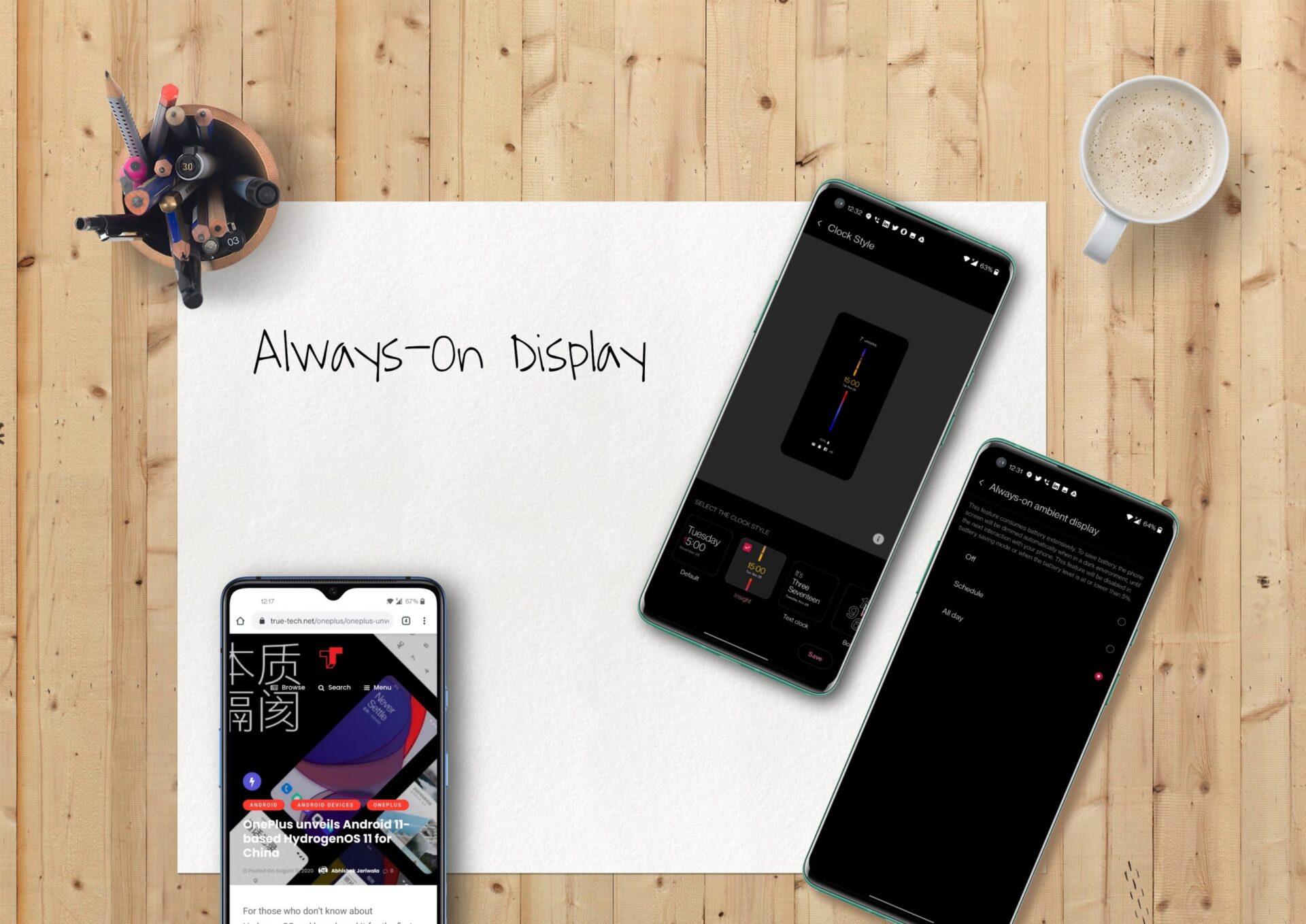
One of the biggest new features included in Oxygen OS 11 has to be the Always-on Display. There are 12 different clock styles for the AOD but the Insight AOD stands out from the other styles. This is designed in partnership with students from the Parsons School of Design. The Insight AOD brings a colorful bar in the middle that will break every time you lock and unlock the phone. Meaning the longer you lock the phone or not use it, the longer the break gets or vise-versa. On the top-middle of the display, it shows the number of times you unlocked your device.

The other clock styles are pretty basic and decent at best. But, as OnePlus mentioned in their changelog or the key changes, the rest of the clocks are not completely new! It is worth noting that none of these clocks look bright enough on the Always-on display. The AOD format is just the same here, as you can see the time, date, day, battery, and notification icons.

Visual Overhaul

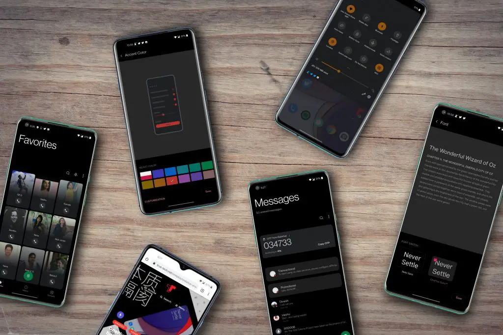
As mentioned earlier, the latest Oxygen OS is a long departed from its previous versions. There is no stock Android feel anymore as the revamped visuals bring in more like a heavy Android-skin sense making the whole UI closer to EMUI and One UI. All the system applications like contacts, messaging, dialer, and etc are revised with One UI like implementation where most of the tasks can be performed single-handed.

The layout of the UI elements is quite noticeable as most of the responsive content is shifted to the lower 2/3 of the screen. The interface is partially broken in few applications like the Gallery a few elements are not labeled and are not even clearly recognizable, making the UI more inconsistent. But again, this version of Oxygen OS is still in development and testing phase.

The much loved OnePlus Slate font is gone now and is replaced with OnePlus Sans, which does not stand out from the standard Roboto very much. Although OnePlus claims that this font improves the overall readability, it is definitely not a welcome move from the OnePlus Slate which is much pleasing to look at. Oxygen OS also brings a new live wallpaper to the table which supposedly changes according to time of day. Again, the changes are very subtle.

As far as the dark mode is considered, I personally did not like it. The dark color here is not consistent at all. In a few places, it has everyone’s favorite pitch black, in a few places it is gray, and there interface adopts dark blue at some places. Although the newly optimized dark mode is allegedly certified for better accessibility standards by Web Content Accessibility Guidelines, I found these colors to be overwhelming.

Another thing I did not like here is that the Dark mode for third-party applications is mostly broken. A few UI elements are decolorized. For example, the Play-Pause button on Spotify is not properly visible. Well, this is a similar case with MIUI 12 too. And there is no option to disable this so-called feature for third-party applications. The only workaround here is navigating to Dark More and disable the dark mode for applications one by one. Well, again we can call this as a development stage issue, but it only gets much worse.

The dark more also applies to the images on Instagram at times. Take a look at the image below with the dark mode turned off and on. Yes, dark mode glitches are common with third-party applications, but this is totally unacceptable. We can only hope that OnePlus takes a note to fix such issues.
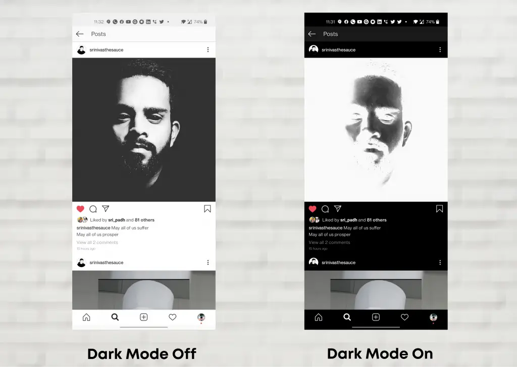
Screenshots of Instagram with Dark Mode turned on and off.

A few people say that the visual redesign looks like Samsung’s One UI, others say that it looks like Windows Phone OS, but we just say that this doesn’t feel like an Oxygen OS anymore!

But Oxygen OS still implements a few feats to sustain that near to stock impression. For starters, stock Android 11’s notifications got a great trade with the addition of a completely new section dubbed Conversations. Although OEMs aren’t required to implement this, OnePlus fancied doing so with their latest Oxygen OS. Now this means, a few notifications from messaging applications are instantly placed above the notifications and other notifications sections. Also, the conversations pop out as a floating chat heads Bubble only with a few applications.


The quick settings panel did not get any new changes from Oxygen OS 10, but it is worth noting that OnePlus did not add the media player inside the quick settings yet. For those who did not know, this is a new feature that Android 11 has featured which quickly has gained a lot of attention.

Enhanced Zen Mode and Weather

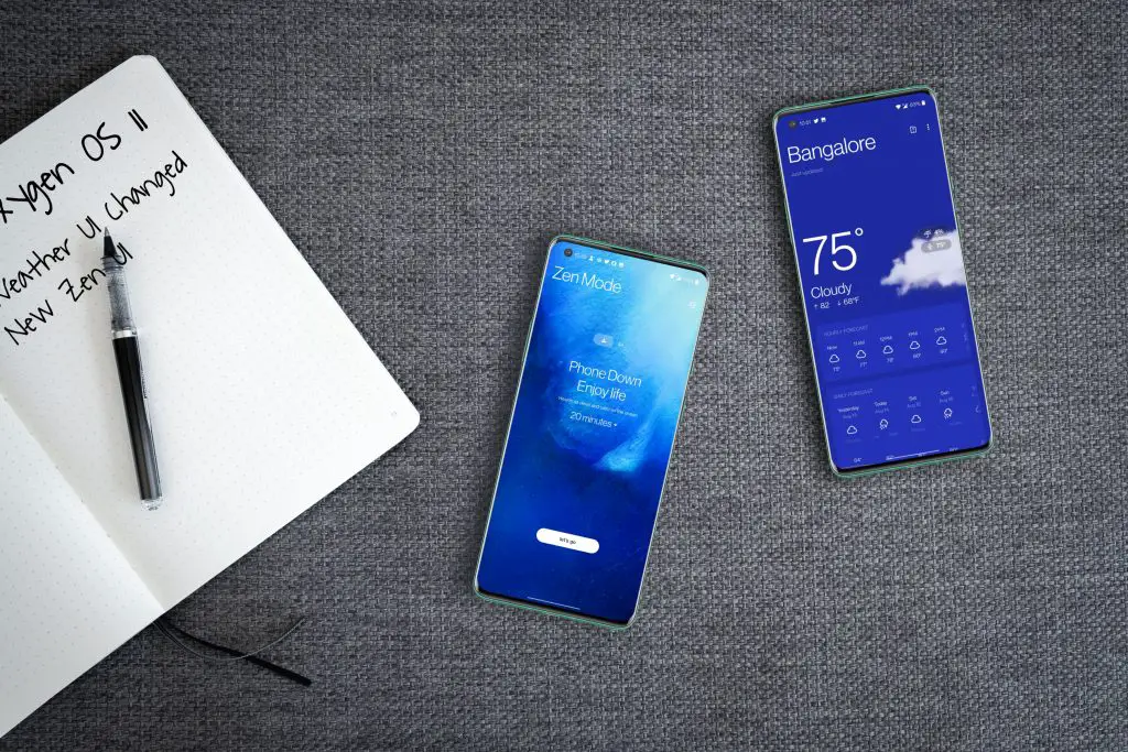
Zen Mode on OnePlus is one of the finest and underrated digital mindfulness inclusion. Zen Mode has evolved a lot with the time and with Oxygen OS 11, Zen Mode is completely redefined. Now you can set the length in more numbers anywhere from a one-minute to 120-minutes. In addition to this, the new Weather application also underwent a huge visual overhaul to match the new Oxygen OS 11’s design. The implementation here is somewhere in the middle of MIUI and iOS’ Weather.

Final Thoughts

Oxygen OS 11 has to be the second bold new move by the company after the OnePlus Nord. It is still unknown why OnePlus has decided to reverse the game. While the users are asking more and more company’s to adopt near to stock experience like Oxygen OS with their proprietary interfaces, it is sad watching OnePlus doing the opposite. Most of the fans are annoyed by this decision. Even I cannot see myself using an interface like this.

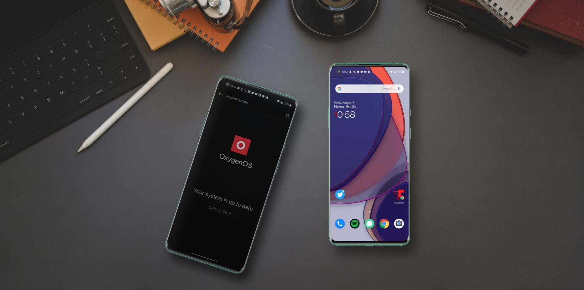
I always have admired Oxygen OS for its smoothness, features, and stock experience. Now the only words I can think of are “Oxygen OS is a straight-up One UI rip-off ” and I am definitely not a fan of it. Now the real question here is will this be the final version of the Oxygen OS before the release? Well, the answer is Yes. Given how close we are to the release of Android 11 for Pixel devices, this build of Oxygen OS 11 is likely based upon Beta 2 or Beta 3, making it pretty final. We assume that more features will be added to the final UI, but this is how the UI is gonna look until Oxygen OS 12.
Share This Article
Follow:
TrueTech's Editor Tarun Tej is a Hyderabad-based writer and journalist whose work has appeared in various magazines. Tarun is an avid photographer, music lover, and TV Series-buff. He finds the ultimate joy when writing about the latest tech and entertainment stuff.
Leave a Comment

OnePlus’ Oxygen OS is one of the most popular Android UI’s out there. Oxygen OS was first launched in 2015, and it was pronounced as a better version of Stock Android. Recently, OnePlus rolled out the Android 11 Developers Preview which brings the much-awaited Oxygen OS 11 update. We installed this latest Developer Preview on our OnePlus 8 and we can without a doubt say that this is the biggest overhaul any Android-based UI has ever seen!

OnePlus seems like they are done with that near to stock Android experience. This is a very bold step by the company, I mean, let’s face it, Oxygen OS is the USP for the OnePlus devices. The UI takes a lot of best parts from Samsung’s One UI, which is not totally a bad thing, but they made it explicit! Oxygen OS 11 brings a lot of features and changes to the table. For starters, the app menu headers are redesigned, settings menu gets minimalistic icons, and more importantly, Oxygen OS 11 brings the most requested Always-on display feature.

OnePlus has confirmed all its major new changes in a dedicated blog post announcing the rollout of the final Oxygen OS 11 or Android 11 Betas. This is the final build of Android 11 on OnePlus hardware before a series of Open Betas in the coming months. The “Key” changes and the known issues are described by OnePlus as mentioned below:

[su_spacer size=”30″]


[su_spacer size=”30″]

[su_box title=”Key Notes:” box_color=”#ED2024″ title_color=”#ffffff” radius=”0″]

  1. New visual design (including Weather app, Launcher, Gallery, Notes.
  2. New layout for more comfortable and convenient one-handed operation.
  3. Always-on display function, including 11 new clock styles. Live wallpaper that changes according to the time of day.
  4. New OnePlus Sans font that improves readability. Optimized Dark Mode, including the ability to automatically turn on and off and a shortcut in Quick Settings.
  5. 3 new Zen Mode themes, more timing options, and a new Group feature to let you experience Zen Mode with your friends.
  6. New Gallery function that automatically creates a weekly story based on your photos and videos.

[/su_box]

[su_spacer size=”30″]


[su_spacer size=”30″]

Always-on Display

One of the biggest new features included in Oxygen OS 11 has to be the Always-on Display. There are 12 different clock styles for the AOD but the Insight AOD stands out from the other styles. This is designed in partnership with students from the Parsons School of Design. The Insight AOD brings a colorful bar in the middle that will break every time you lock and unlock the phone. Meaning the longer you lock the phone or not use it, the longer the break gets or vise-versa. On the top-middle of the display, it shows the number of times you unlocked your device.

The other clock styles are pretty basic and decent at best. But, as OnePlus mentioned in their changelog or the key changes, the rest of the clocks are not completely new! It is worth noting that none of these clocks look bright enough on the Always-on display. The AOD format is just the same here, as you can see the time, date, day, battery, and notification icons.

Visual Overhaul

As mentioned earlier, the latest Oxygen OS is a long departed from its previous versions. There is no stock Android feel anymore as the revamped visuals bring in more like a heavy Android-skin sense making the whole UI closer to EMUI and One UI. All the system applications like contacts, messaging, dialer, and etc are revised with One UI like implementation where most of the tasks can be performed single-handed.

The layout of the UI elements is quite noticeable as most of the responsive content is shifted to the lower 2/3 of the screen. The interface is partially broken in few applications like the Gallery a few elements are not labeled and are not even clearly recognizable, making the UI more inconsistent. But again, this version of Oxygen OS is still in development and testing phase.

The much loved OnePlus Slate font is gone now and is replaced with OnePlus Sans, which does not stand out from the standard Roboto very much. Although OnePlus claims that this font improves the overall readability, it is definitely not a welcome move from the OnePlus Slate which is much pleasing to look at. Oxygen OS also brings a new live wallpaper to the table which supposedly changes according to time of day. Again, the changes are very subtle.

As far as the dark mode is considered, I personally did not like it. The dark color here is not consistent at all. In a few places, it has everyone’s favorite pitch black, in a few places it is gray, and there interface adopts dark blue at some places. Although the newly optimized dark mode is allegedly certified for better accessibility standards by Web Content Accessibility Guidelines, I found these colors to be overwhelming.

Another thing I did not like here is that the Dark mode for third-party applications is mostly broken. A few UI elements are decolorized. For example, the Play-Pause button on Spotify is not properly visible. Well, this is a similar case with MIUI 12 too. And there is no option to disable this so-called feature for third-party applications. The only workaround here is navigating to Dark More and disable the dark mode for applications one by one. Well, again we can call this as a development stage issue, but it only gets much worse.

The dark more also applies to the images on Instagram at times. Take a look at the image below with the dark mode turned off and on. Yes, dark mode glitches are common with third-party applications, but this is totally unacceptable. We can only hope that OnePlus takes a note to fix such issues.

Screenshots of Instagram with Dark Mode turned on and off.

A few people say that the visual redesign looks like Samsung’s One UI, others say that it looks like Windows Phone OS, but we just say that this doesn’t feel like an Oxygen OS anymore!

But Oxygen OS still implements a few feats to sustain that near to stock impression. For starters, stock Android 11’s notifications got a great trade with the addition of a completely new section dubbed Conversations. Although OEMs aren’t required to implement this, OnePlus fancied doing so with their latest Oxygen OS. Now this means, a few notifications from messaging applications are instantly placed above the notifications and other notifications sections. Also, the conversations pop out as a floating chat heads Bubble only with a few applications.


The quick settings panel did not get any new changes from Oxygen OS 10, but it is worth noting that OnePlus did not add the media player inside the quick settings yet. For those who did not know, this is a new feature that Android 11 has featured which quickly has gained a lot of attention.

Enhanced Zen Mode and Weather

Zen Mode on OnePlus is one of the finest and underrated digital mindfulness inclusion. Zen Mode has evolved a lot with the time and with Oxygen OS 11, Zen Mode is completely redefined. Now you can set the length in more numbers anywhere from a one-minute to 120-minutes. In addition to this, the new Weather application also underwent a huge visual overhaul to match the new Oxygen OS 11’s design. The implementation here is somewhere in the middle of MIUI and iOS’ Weather.

Final Thoughts

Oxygen OS 11 has to be the second bold new move by the company after the OnePlus Nord. It is still unknown why OnePlus has decided to reverse the game. While the users are asking more and more company’s to adopt near to stock experience like Oxygen OS with their proprietary interfaces, it is sad watching OnePlus doing the opposite. Most of the fans are annoyed by this decision. Even I cannot see myself using an interface like this.

I always have admired Oxygen OS for its smoothness, features, and stock experience. Now the only words I can think of are “Oxygen OS is a straight-up One UI rip-off ” and I am definitely not a fan of it. Now the real question here is will this be the final version of the Oxygen OS before the release? Well, the answer is Yes. Given how close we are to the release of Android 11 for Pixel devices, this build of Oxygen OS 11 is likely based upon Beta 2 or Beta 3, making it pretty final. We assume that more features will be added to the final UI, but this is how the UI is gonna look until Oxygen OS 12.
Share This Article
Follow:
TrueTech's Editor Tarun Tej is a Hyderabad-based writer and journalist whose work has appeared in various magazines. Tarun is an avid photographer, music lover, and TV Series-buff. He finds the ultimate joy when writing about the latest tech and entertainment stuff.
Leave a Comment