New Update: Wikipedia Android App Gets Modernized Widgets

Wikipedia Update

Jeeva Shanmugam
By Jeeva Shanmugam
4 Min Read
Highlights
  • Wikipedia app for Android gets a major redesign with new widgets.
  • Introducing "Wikipedia search" and "Wikipedia featured page" widgets for enhanced user experience.
  • Improved themes and design elements ensure a more customizable experience for Android users.

The Wikipedia Android app has experienced a major redesign that revitalizes its widget functionality. In an effort to update the user experience, the most recent version introduces several improvements that are a significant step up from earlier versions.

Wikipedia Android App Receives Modernized Widgets

Two of the update’s main features are the addition of two new widgets, “Wikipedia search” and “Wikipedia featured page.”

Users are greeted by the “Wikipedia search” widget’s sleek, modern design, which includes a simplified search bar and the recognizable Wikipedia logo. This widget, which offers quick access to Wikipedia’s extensive knowledge base, seamlessly integrates with the user’s home screen. It is available in a 2×1 size that can be expanded to 5×1 for added convenience.

The developers warn that although it can be resized to 1×1, there might be some slight visual irregularities in this arrangement. By simply tapping on the widget, users can quickly enter the world of exploration and discovery on Wikipedia.
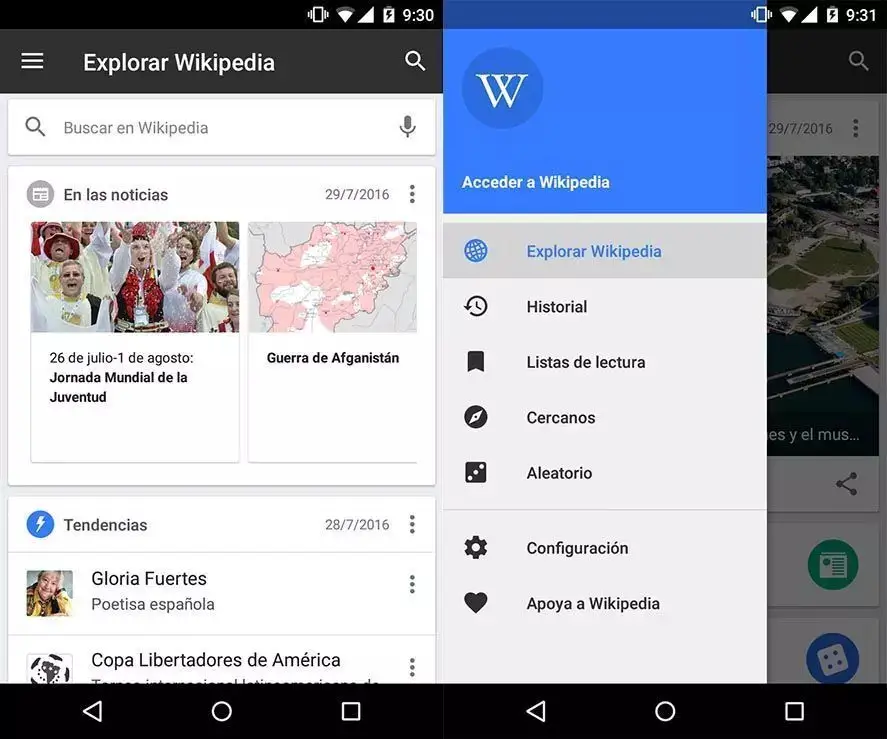
Image Credits: UptoDown

The brand-new “Wikipedia featured page” widget, which displays the day’s featured article in an eye-catching way, goes well with the search widget. Including the title of the article, a brief synopsis, and an image to go along with it, this widget acts as an entry point to the plethora of information that the app has carefully selected. Although users can change its height, they cannot access any further content after the initial presentation.

Among the notable improvements included in this update is the addition of light and dark themes for the widgets, which accommodate a range of user preferences. Previously limited to a light theme, this expansion guarantees a smooth transition with different device themes, thereby improving the user experience even more.

Android users should expect an improved app experience with version 2.7.50475-r-2024-03-06, which is being released progressively via the Google Play Store. Additionally, the free-online encyclopedia has a dedicated Beta program that grants early access to upcoming updates and improvements for enthusiasts eager to test out the newest features before the general release.

This most recent version comes soon after the Wikipedia app underwent a thorough redesign. With a redesigned Material You bottom bar that is embellished with pill-shaped tab indicators, the app has a contemporary look, even though it is a little bit smaller than native Google apps.

Link previews gain from rounded sheets, while Dynamic Color theming is absent, making for a more unified visual experience. In addition, the addition of a tab switcher user interface (UI) for articles that is evocative of Chrome’s pre-grid layout gives experienced browser users a sense of familiarity and enhances the browsing experience.

Overall, the most recent update to the free-online encyclopedia app for Android breathes new life into both its design and functionality. The free-online encyclopedia is keeping its promise to provide its worldwide audience with an engaging and user-friendly experience by adding new and user-friendly widgets and continuously improving the app’s interface.
TAGGED:
Share This Article
Making spicy content on the Internet!
Leave a Comment
Highlights
  • Wikipedia app for Android gets a major redesign with new widgets.
  • Introducing "Wikipedia search" and "Wikipedia featured page" widgets for enhanced user experience.
  • Improved themes and design elements ensure a more customizable experience for Android users.

The Wikipedia Android app has experienced a major redesign that revitalizes its widget functionality. In an effort to update the user experience, the most recent version introduces several improvements that are a significant step up from earlier versions.

Wikipedia Android App Receives Modernized Widgets

Two of the update’s main features are the addition of two new widgets, “Wikipedia search” and “Wikipedia featured page.”

Users are greeted by the “Wikipedia search” widget’s sleek, modern design, which includes a simplified search bar and the recognizable Wikipedia logo. This widget, which offers quick access to Wikipedia’s extensive knowledge base, seamlessly integrates with the user’s home screen. It is available in a 2×1 size that can be expanded to 5×1 for added convenience.

The developers warn that although it can be resized to 1×1, there might be some slight visual irregularities in this arrangement. By simply tapping on the widget, users can quickly enter the world of exploration and discovery on Wikipedia.

Image Credits: UptoDown

The brand-new “Wikipedia featured page” widget, which displays the day’s featured article in an eye-catching way, goes well with the search widget. Including the title of the article, a brief synopsis, and an image to go along with it, this widget acts as an entry point to the plethora of information that the app has carefully selected. Although users can change its height, they cannot access any further content after the initial presentation.

Among the notable improvements included in this update is the addition of light and dark themes for the widgets, which accommodate a range of user preferences. Previously limited to a light theme, this expansion guarantees a smooth transition with different device themes, thereby improving the user experience even more.

Android users should expect an improved app experience with version 2.7.50475-r-2024-03-06, which is being released progressively via the Google Play Store. Additionally, the free-online encyclopedia has a dedicated Beta program that grants early access to upcoming updates and improvements for enthusiasts eager to test out the newest features before the general release.

This most recent version comes soon after the Wikipedia app underwent a thorough redesign. With a redesigned Material You bottom bar that is embellished with pill-shaped tab indicators, the app has a contemporary look, even though it is a little bit smaller than native Google apps.

Link previews gain from rounded sheets, while Dynamic Color theming is absent, making for a more unified visual experience. In addition, the addition of a tab switcher user interface (UI) for articles that is evocative of Chrome’s pre-grid layout gives experienced browser users a sense of familiarity and enhances the browsing experience.

Overall, the most recent update to the free-online encyclopedia app for Android breathes new life into both its design and functionality. The free-online encyclopedia is keeping its promise to provide its worldwide audience with an engaging and user-friendly experience by adding new and user-friendly widgets and continuously improving the app’s interface.
TAGGED:
Share This Article
Making spicy content on the Internet!
Leave a Comment