Google is working on the new Material Design which is sort of a roadmap for all future changes and updates to be made in all Google apps and other properties. The teased Material design surface on Vimeo designed by Nicolo Bianchino and Adam Grabowski, however, it was pulled off from Vimeo but till then, several users had uploaded the video on other social networking sites such as Twitter. The video revealed a lot of changes that will be made in all Google apps in the coming weeks.
Google Material Design pic.twitter.com/10Od0oUmgX
— RΛMIN NΛSIBOV (@RaminNasibov) July 24, 2018
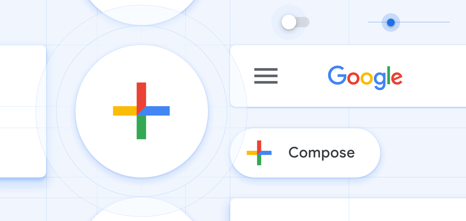
The video is just 1:37 minutes long and shows slides and transitions pretty quickly which means, one can miss a certain detail even if there’s a second of lack of attention. First of all, the floating action button has been rejigged to the center position just above the bottom bar where the bar follows the curves of the button from left to right.
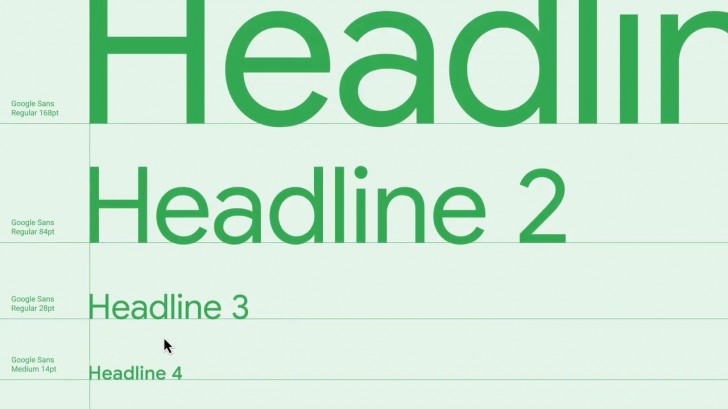
Google Sans, the most used font typeface in all Google apps and properties has received its share of tweaks as Google will eventually roll out the cleaner and leaner version of Google Sans shortly. The tech giant is emphasizing the user of four principle colors used on the Google logo i.e Green, Blue, Yellow, and Red. These colors are currently used as a notation to the ‘loading’ four dots that float across the screen apart from the tabs and sections showing the pinch of these color combinations.
![]()
Next big change that Google Material design will push towards the users is the newly carved out center symbols and icons. The new icons look clean and clutter-free with less visual mass. Designers at Google actually carved out center portions of the icons to give out more white color which looks lighter and impressive.
Forget the cursor blinking in just ‘blue’ color as Google will roll out the update after which, the cursor will blink and change its color from blue to green to red to yellow on a loop. What’s more astounding change is the new UI where Google has emphasized the while color to a great extent. The revamped UI is white-washed and the sizes of all icons and tabs have been reduced to enhance the overall while user interface.
Although it looks crisp and tidy, it may not be too overwhelming for smartphones with OLED screens, however, Google might unveil a dark UI which isn’t too difficult to obtain since Google has already got rid of all the other colors and has painted the UI with whites only. Turning the UI into dark will simply take a step where designers will have to invert colors and that’s all, no more UI blunder or color blending in or such situations.
Some of the changes touted in the recently teased Google Material design have been already rolled out in the past, however, it’s just the tip of a large iceberg which means, there are a plethora of updates that users will get to see soon.